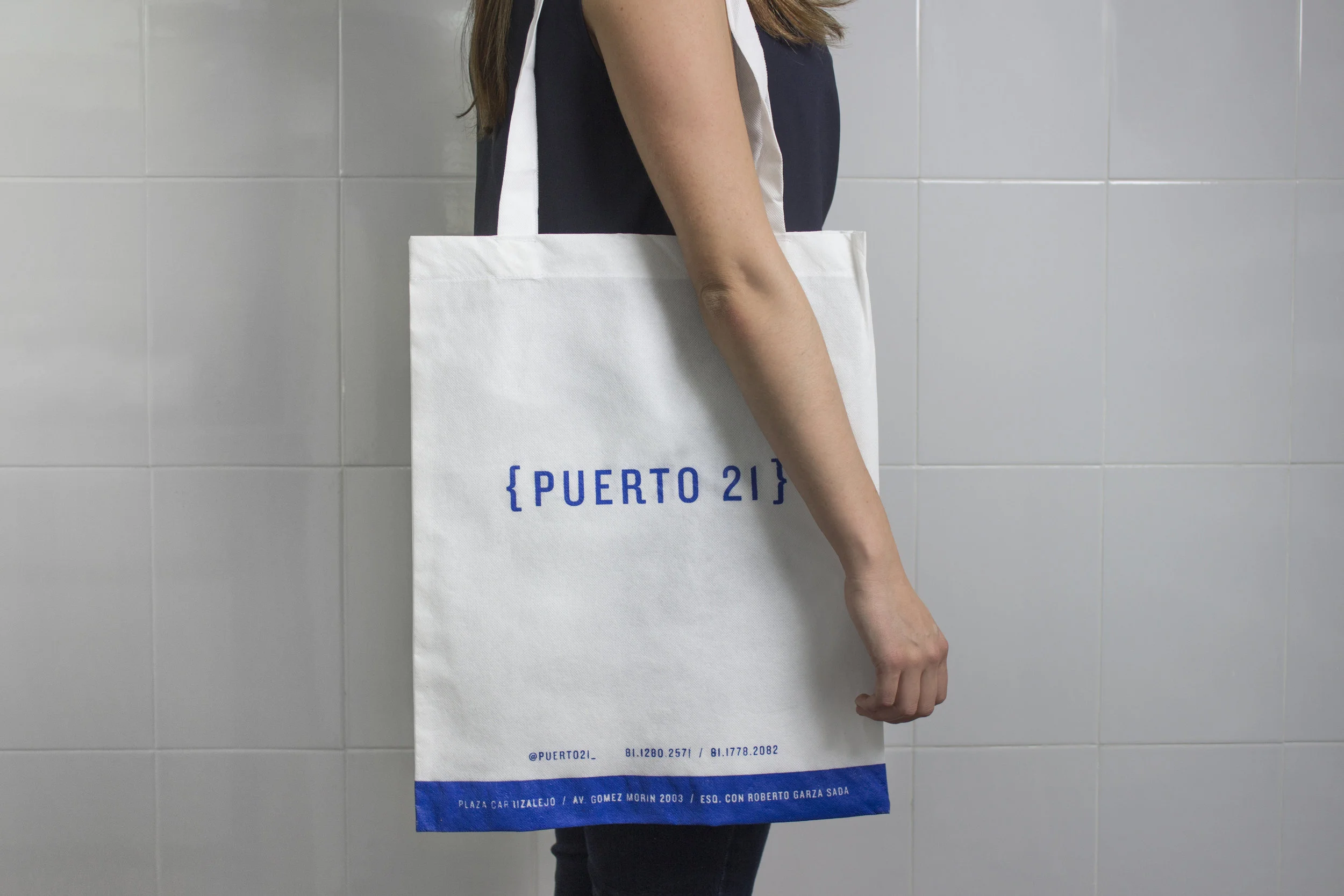
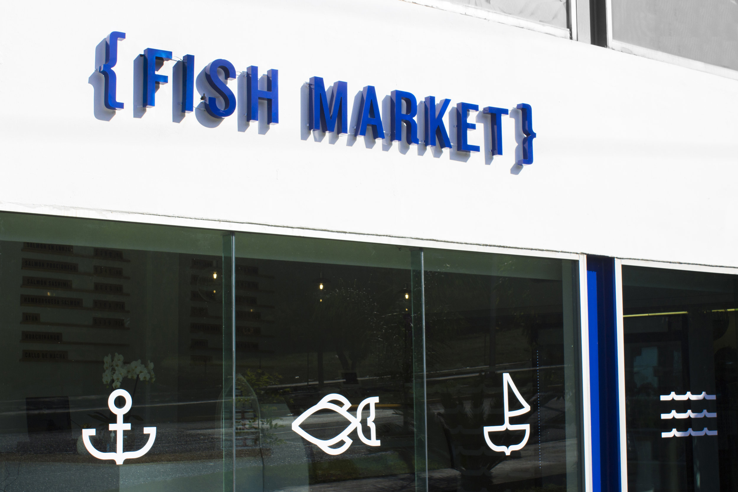
Puerto 21 is a brand dedicated to the distribution of seafood products. The identity stemmed from the brace symbol, which resembled a fish tail and was born from the typography itself. This brace is used throughout the system, for example to form icons or graphics. The brand evokes freshness and quality, so the color palette was limited to bright blue and red. These worked as accent colors with the neutral interior materials: white tiles, wood and stainless steel.
The brand colors were also used to identify spicy foods with red and non-spicy with blue.
WHAT WE DID:
— Branding
Interior design: Daniela Longoria
