
THE BRIEF
With a name and a store ready to open its doors, Terra Refill came to us looking to give their brand a face in only a few weeks.
THE RESULT
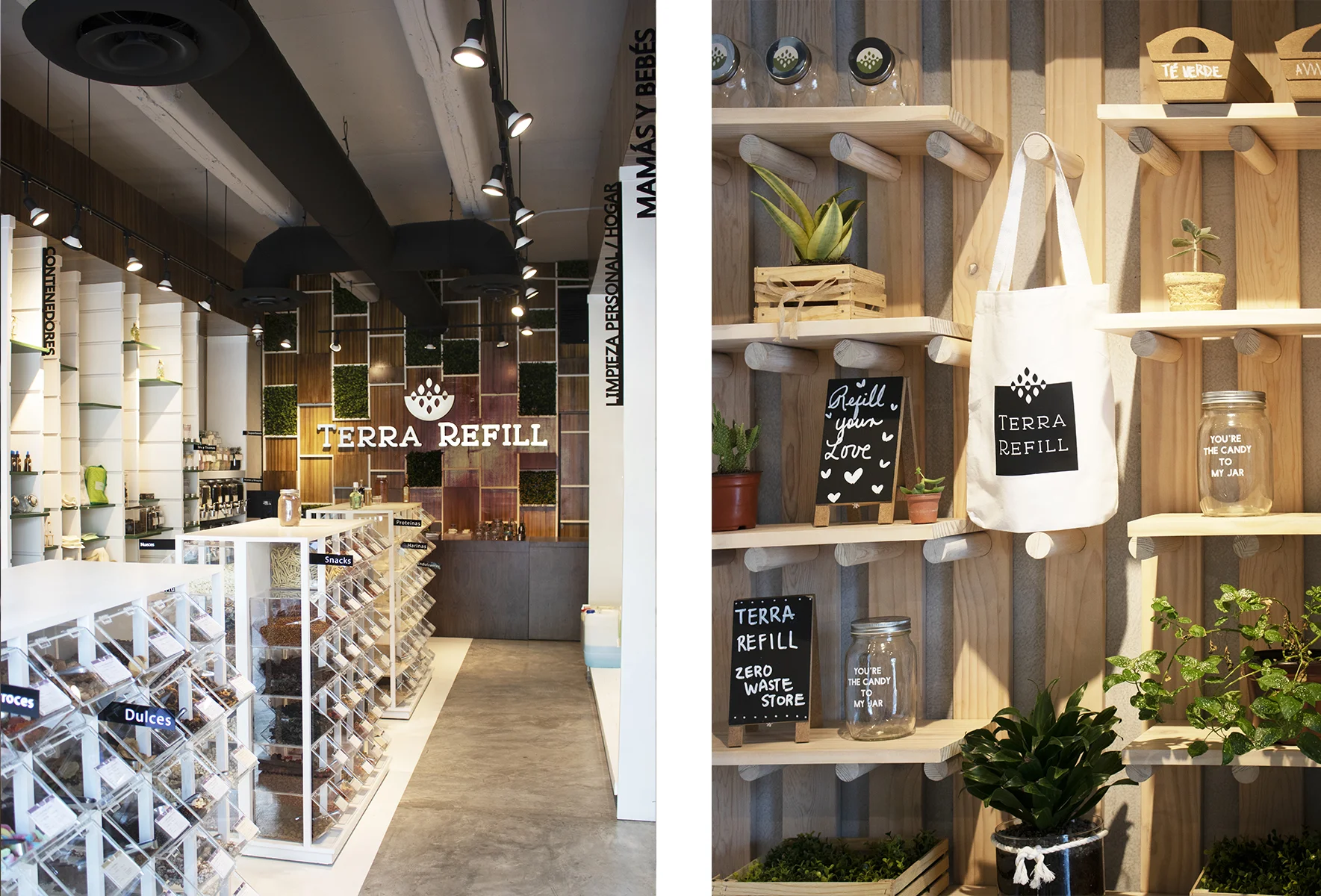
Caracter developed a unique wordmark and designed custom slab-serif letters to give it an organic, friendly vibe. A symbol was designed to accompany the wordmark, depicting the refilling aspect of the business. Together with a brand color palette of earthy tones, the identity came together to form Terra Refill. With these elements in place, the identity took form in many ways as Brand Collateral for the business.


BRAND COLLATERAL
The scope of the project included designing signage, iconography, uniforms and labels. The challenge was creating this in a way that wouldn’t create more waste, so we designed stamps for brown paper bags or tote bags so customers could take their products without using plastic.


WHAT WE DID:
— Branding
Design Direction: Adriana Longoria
Design Support: Nicole Diamant, María Paula Valdés
Portfolio Photography: Andrea Quintanilla
VIEW MORE PROJECTS: