
THE BRIEF
Terra Regia came to Caracter looking to rebrand their real estate development firm. They wanted a corporate brand identity design that reflected their culture and work. This meant rebranding the company as fun, innovating, reliable and interesting.
CONFLICT
Their previous identity seemed a little flat and static for the way Terra Regia wanted to express themselves, so we strived to give it some life.

SOLUTION
The result of this rebranding is a dynamic identity design, that showcases Terra Regia’s variety of projects, their work culture and their flexibility.
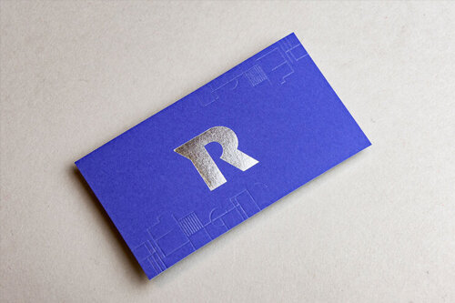
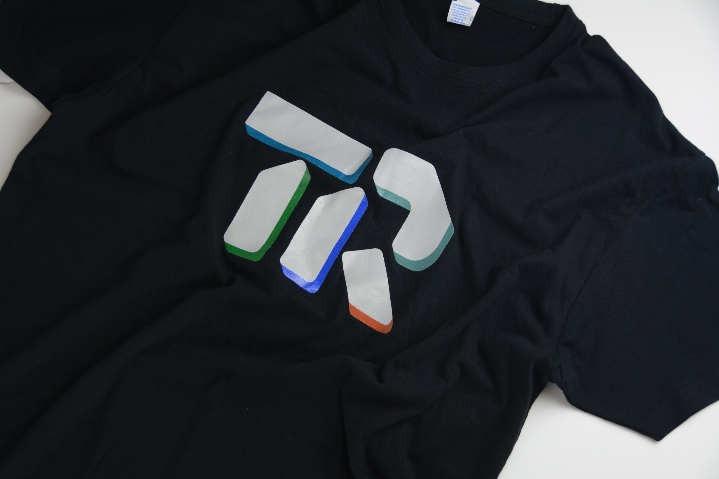
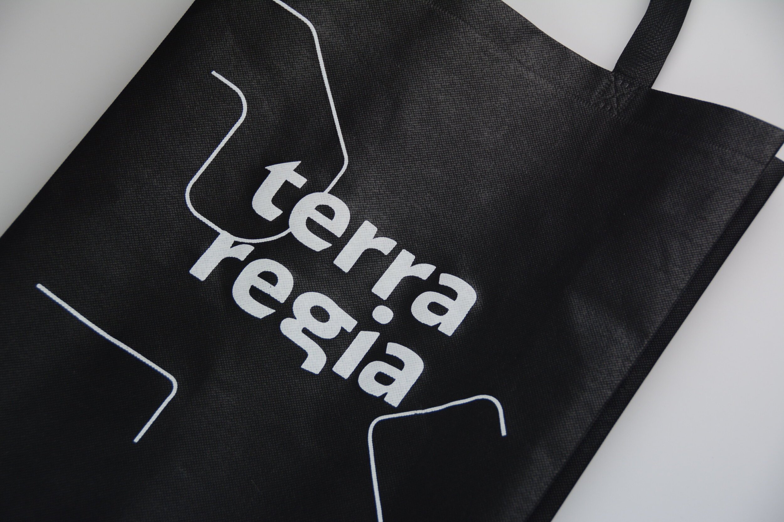
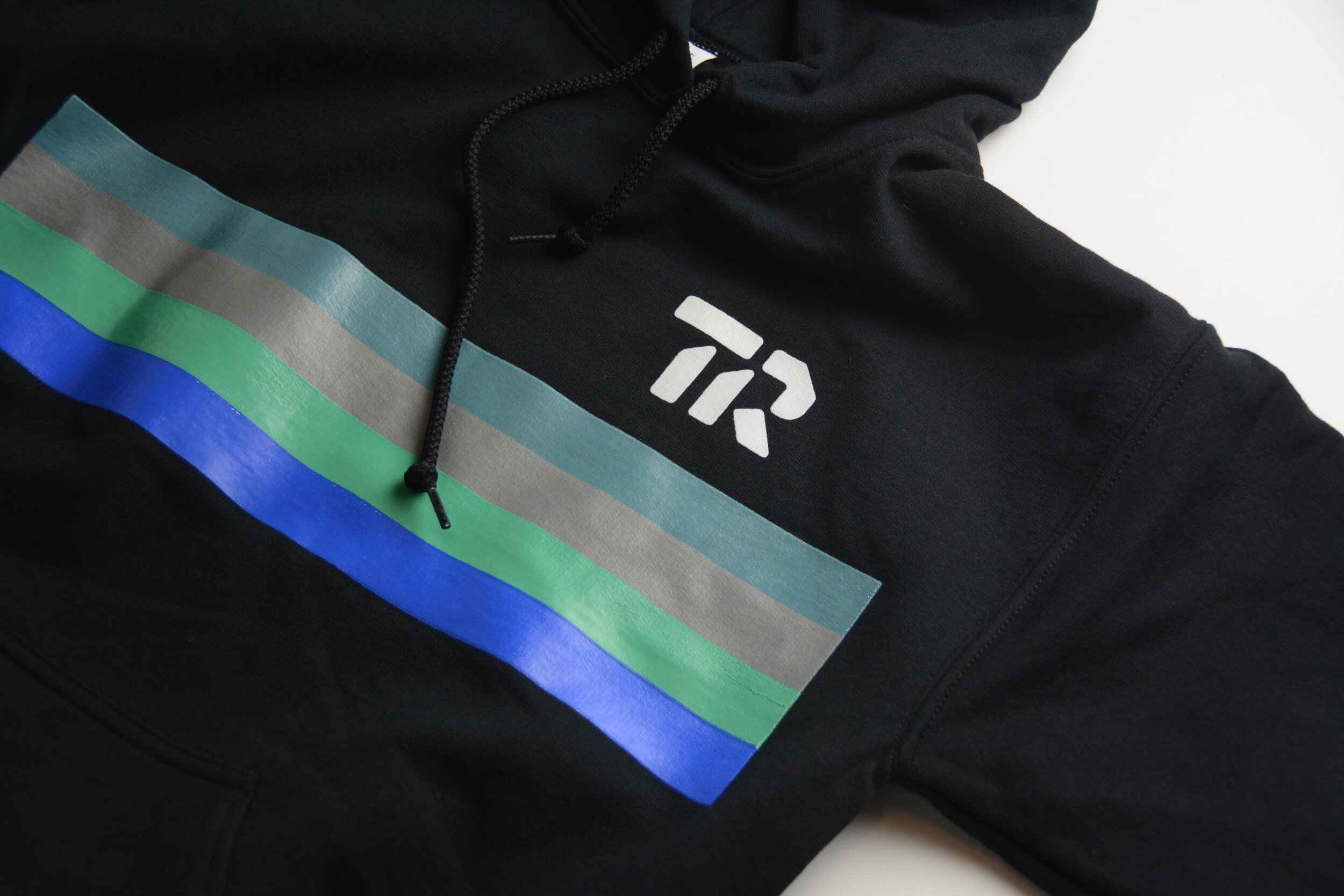
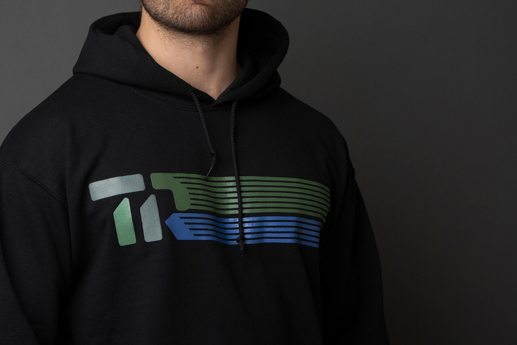
We created a wordmark in lowercase letters to give the brand a more youthful and friendlier approach. A monogram accompanies the brand with a strong presence. It is used as the brand’s dynamic element because it’s solid shapes vary. The monogram can showcase different textures and colors, alluding to the vast amount of projects this company brings to life.


BRAND PATTERN
An animated pattern represents the brand’s background. If seen from a bird’s eye view, the shapes that form the pattern reference properties and lots. When seen as a profile view, these represent buildings. This way the brand truly speaks to how Terra Regia develops cities, from two dimensions to three.

BRAND COLLATERAL
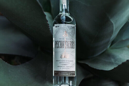
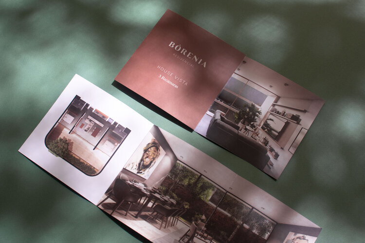
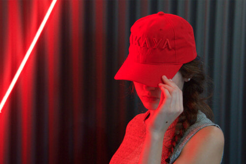
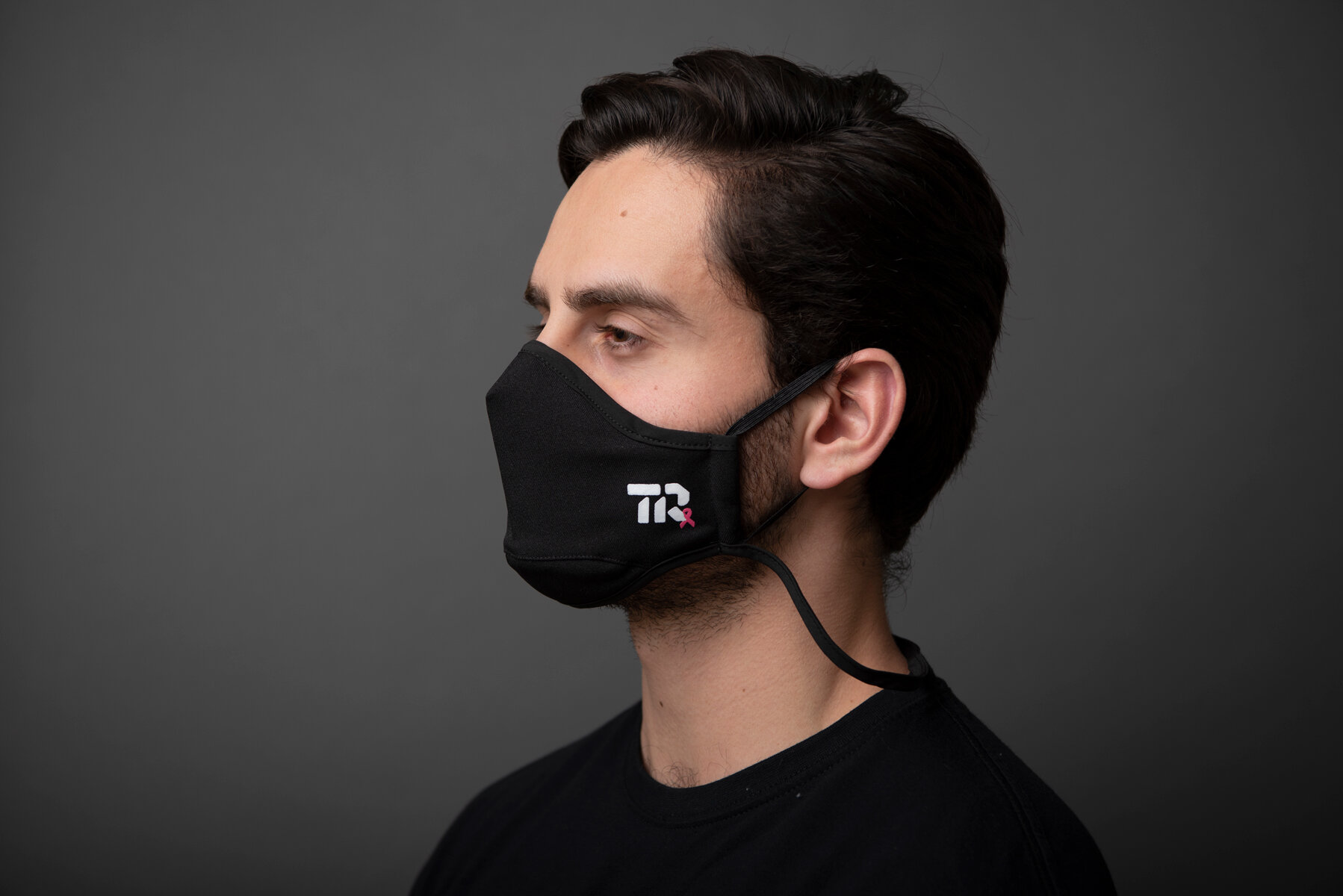
This project involved designing many pieces of branded collateral. Brand merch, specifically, is very important to Terra Regia. As corporate as this business is, Terra Regia cares equally as much about their office culture. This meant designing fun, playful executions of the brand elements to use on products such as hoodies, t-shirts, water bottles, pens, tote bags, face masks, as well as interior design applications.


Terra Regia’s graphic language is used consistently, implementing the use of colors, outlines and shapes in their custom iconography sets, social media, web design, presentation templates and more.


WHAT WE DID:
— Identity Rebranding / Corporate Branding
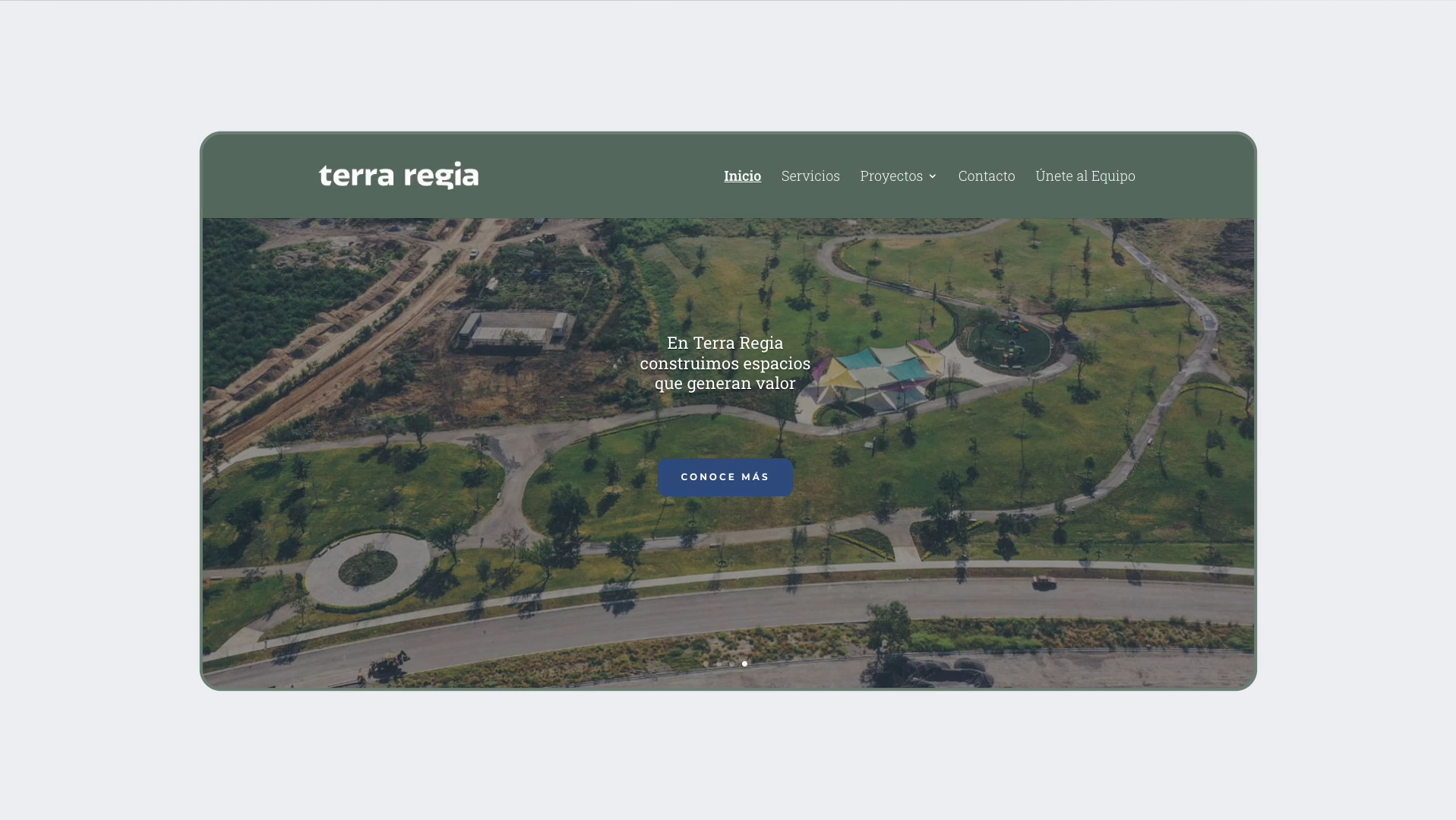
— Web Design
Design: Caracter
Design Direction: Adriana Longoria
Design Support: Regina Kaún & María Paula Valdés
Photography: Adriana Longoria
VIEW MORE PROJECTS: