PHOENIX, ARIZONA
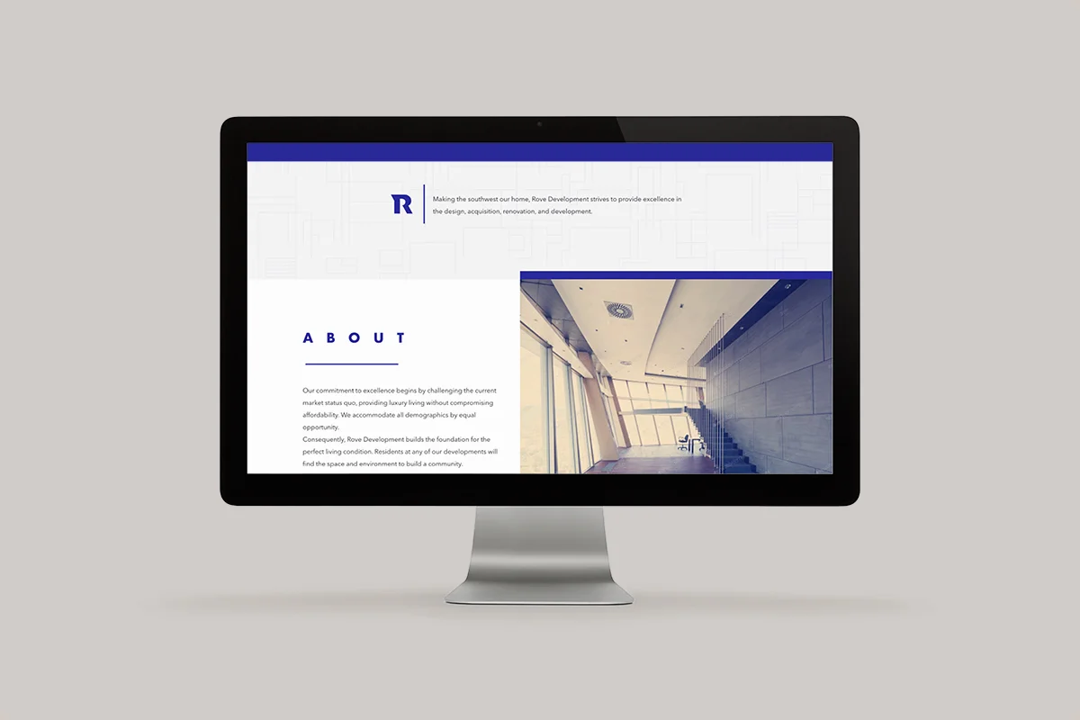
The name behind this Arizonian brand, Rove, is inspired by two elements. The meaning of the word rove is to wander around traveling, but it also combines the owner’s names: Roberto Velez. The word “rove” gave way to our inspiration of the area’s history. Arizona is known to be founded by the settlers who first discovered it, who must have spent much time roving around what is now Phoenix. The phrase “settle in” references this narrative, but also invites clients to feel more welcome in their new homes. buildings, offices, etc.
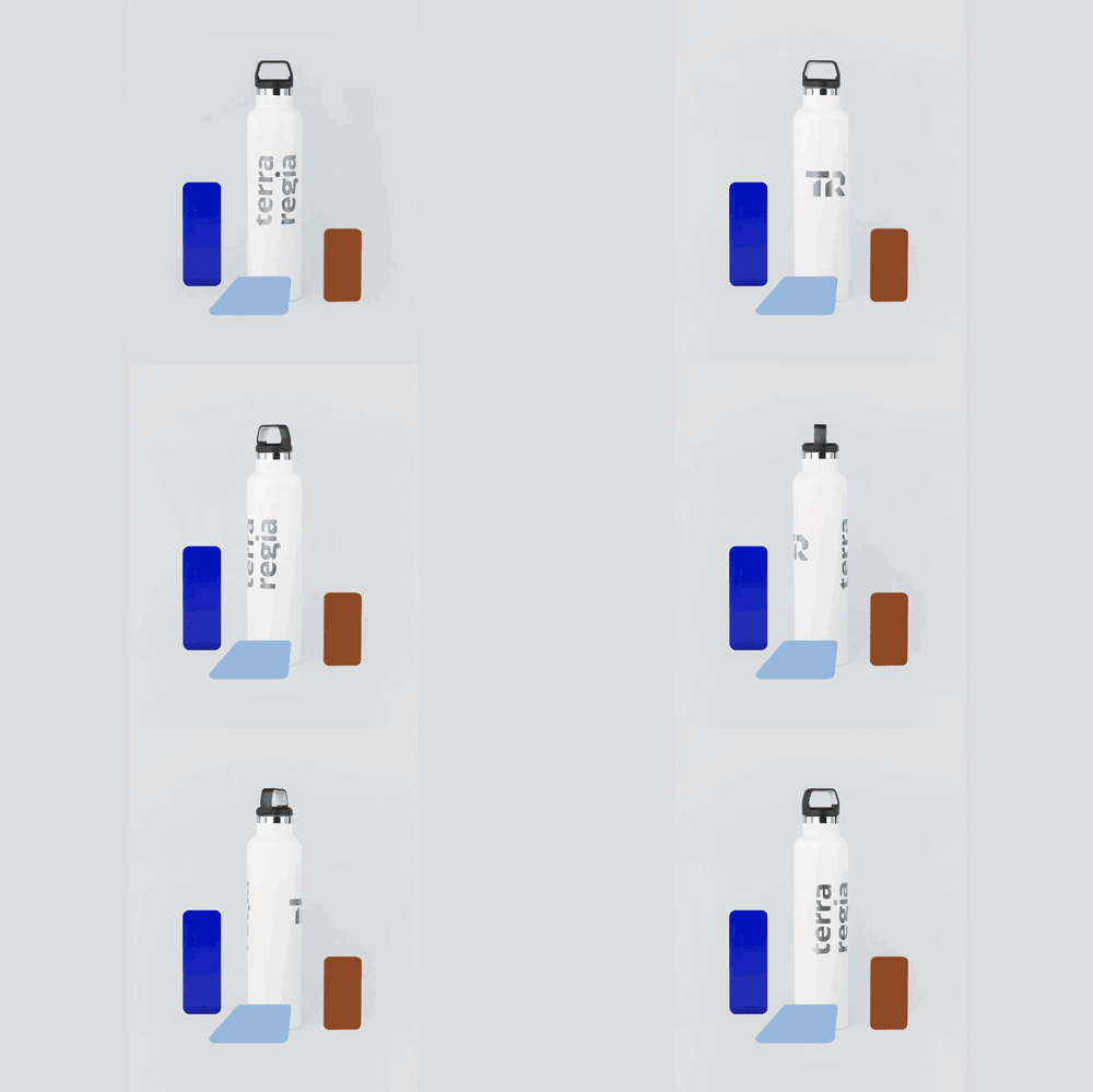
The brand’s pattern is inspired by vertical growth and cities rising, but it takes it’s graphic language from blueprint plans. The headline type references the treatment that is given to titles in maps, where the letters are exaggeratedly spread out.
The brand required a set of icons for usage on the website and informative material. These were formed from the same lines that create the brand pattern.
WHAT WE DID:
— Corporate Branding
— Web Design
Design: Caracter
Design Direction: Adriana Longoria
Design Support: Ale Melo
Photography: Adriana Quintanilla
