THE BRIEF
Nuez de Azahar’s chef, Priscilla Melhem, was looking to give her multicultural confections a new image. We wanted to highlight the inspiration behind the baked treats and translate their high-end taste.
THE RESULT
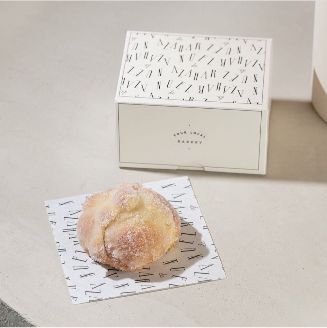
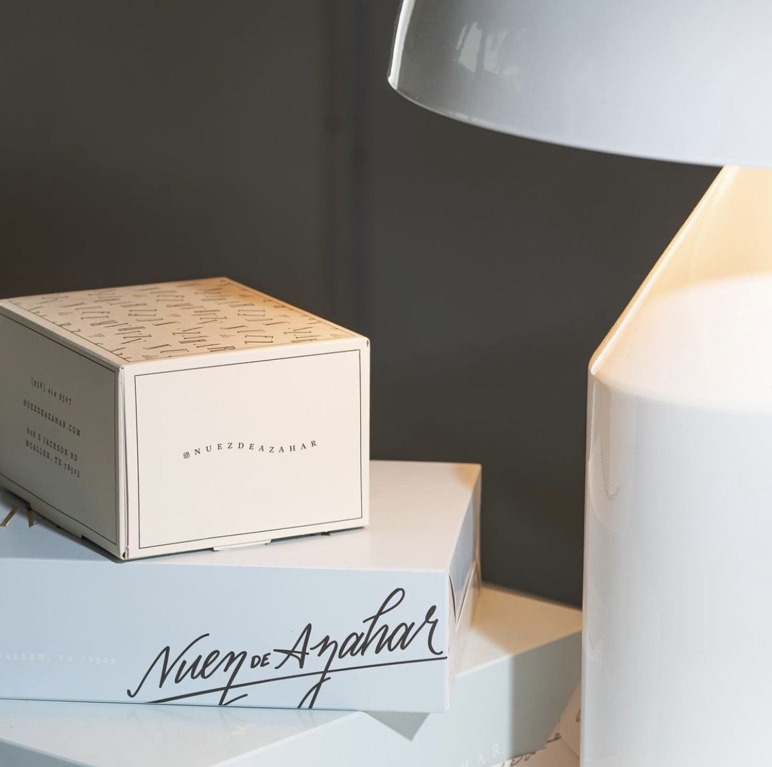
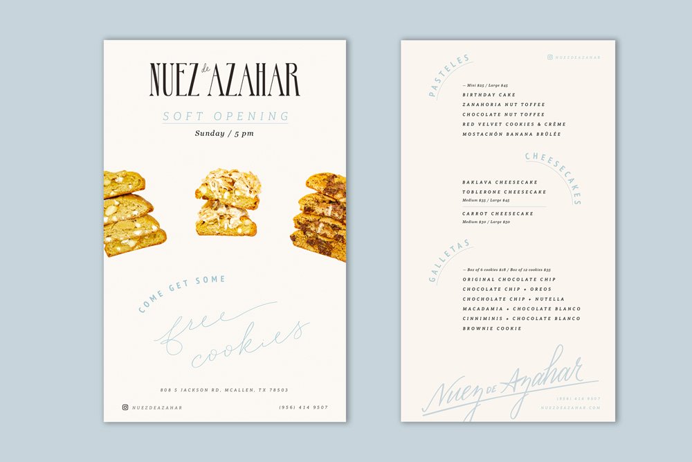
Inspired by French, Lebanese, Mexican and American cuisines, Caracter developed a vintage, french-noir inspired wordmark and a Lebanese monogram from the Arabic letters n & a to use as a symbol. We worked on the packaging and planned this as a dynamic brand where the color palette could evolve with the seasons. The brand’s signature color is a fresh, powder blue, but for Christmas we use a bright orangey red and come Valentine’s, the packages adapt a shade of millenial pink. We maintain the rest of the elements completely identical to keep familiarity, but create a neutral brand that is always relevant and relatable.
HAND-LETTERED MESSAGES
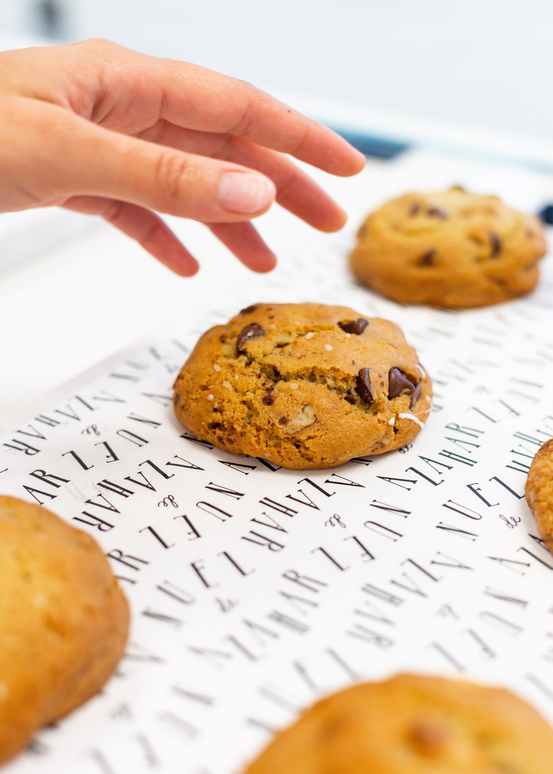
To complement the brand and packaging, we added hand-lettered messages, like Happy Holidays, that can also form a pattern by writing Nuez de Azahar’s product names. These were created to also remind customers of the diverse backgrounds they come from. For example, les cookies, strawberry pistachito, toblerone + fromage, cheesy baklava, etc.
WHAT WE DID:
— Branding & Packaging
Design Direction: Adriana Longoria
Design Team: Regina Kaún
Portfolio Photography: Grupo IAM / Adriana Longoria
