THE BRIEF
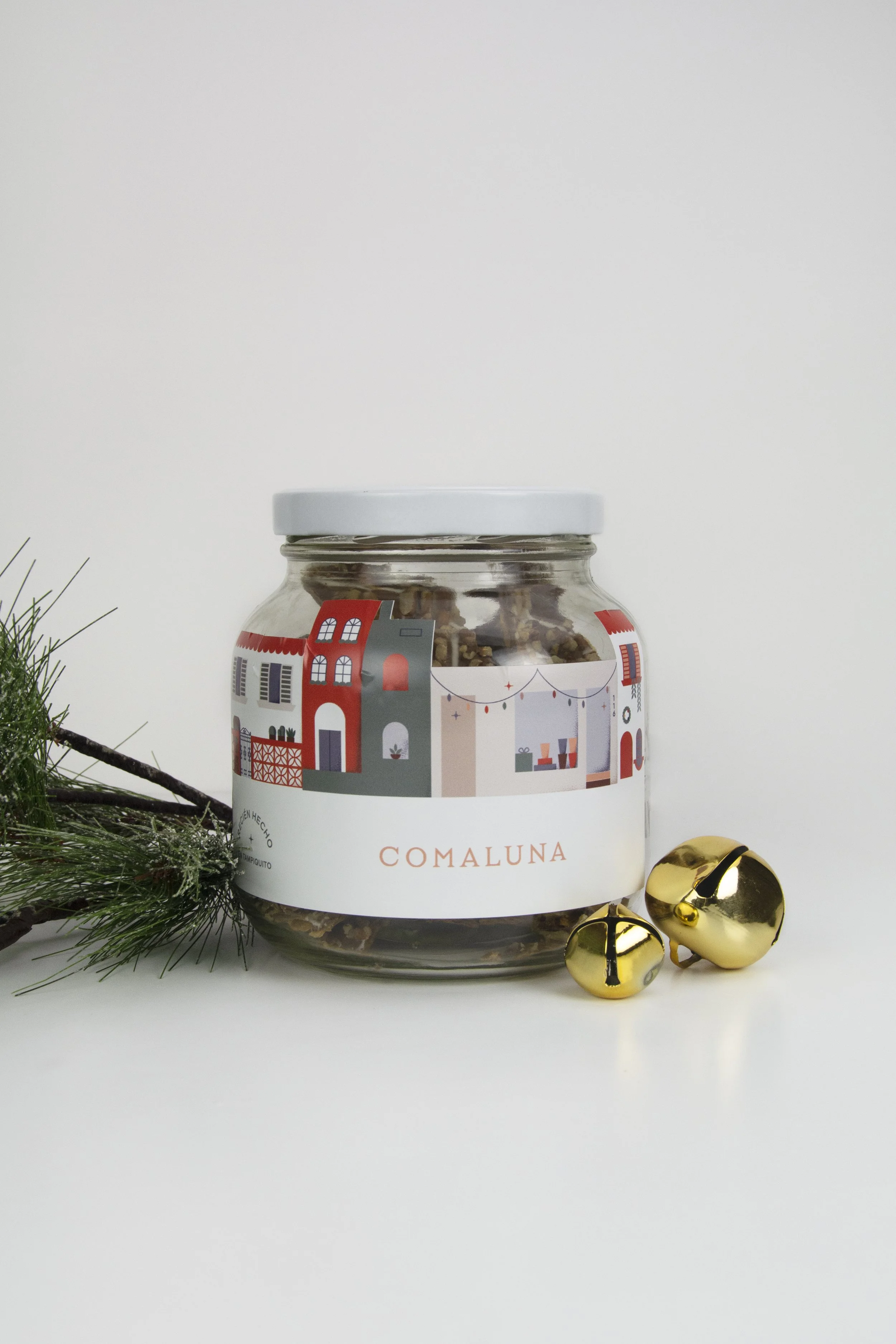
Comaluna was looking to create their Christmas packaging inspired warm, cozy villages.
CONFLICT
Since the store is located in Monterrey, Mexico, we didn’t think a typical snowy Christmas village would fit the concept too well (since we don’t get a lot of snow here in Monterrey).
SOLUTION
Since the pastry store is located in the cutest part of Monterrey, a neighborhood colloquially known as Tampiquito, we decided that this would lead to our village-inspired design.
Tampiquito was reborn through colorful illustrations that formed a modular design system that was then adapted to different packages.
References of the details found in Tampiquito, where Comaluna is located.
THE DESIGN
The colorful surroundings around the store show local architecture styles with arches, decorative blocks, balconies, patterns and cacti. By adding a Christmas sentiment to the scenery, we were able to achieve the village concept while keeping it local. This was then embodied in all of Comaluna’s packaging, such as bags, boxes, the window display, social media material and gift tags.
PACKAGING DESIGN
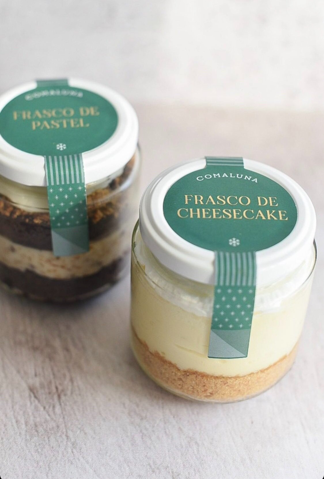
While designing the packaging system, we tried for each product to have its own design. This allowed the collection to not feel too repetitive, but also to allow customers to appreciate different areas of the fictional neighborhood in each package and product. Different sizes allowed for unique designs as well, fitting distinct parts of the system that, when seen as whole, depict the full village.
THE NEW STORE
The idea throughout the collection of packages was also to highlight Comaluna’s storefront in the village design. Comaluna had recently opened in this location, so part of the objective was to make it known that the store can be found in Tampiquito. For this reason, we also added the address in large display type, inviting customers to visit.
The packaging designs complemented the Christmas-themed products perfectly and allowed customers to enjoy or gift their treats surrounded by Christmas spirit.
For their 2022 Christmas packaging, we took some of the previous year’s elements, like colors and shapes and created a new concept with a fresh look. This new collection could still accomodate some of the leftover packages from 2021 because of the connections in style and color.
WHAT WE DID:
— Illustrations
— Packaging Design
Design: Caracter
Design Direction: Adriana Longoria
Designers: Adriana Longoria, Esteban Fuentes and Mariana Euan
Photography: Last 4 by Salt Pepper Studio


