REAL FOOD RESET BOOK DESIGN
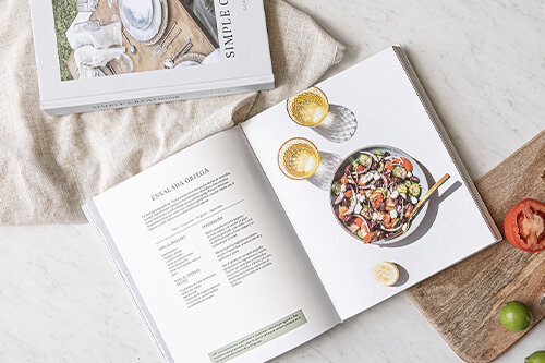
This project demonstrates the book we designed for blog Not a Fancy Kitchen. It is a collection of recipes and theory on resetting the body in an organic way combining nutritious ingredients and healthy habits. We were looking to create a fun, organic look & feel for the identity of the book, with an elegant touch. The process involved creating graphic stains that were similar in texture and tone to the ingredients from the recipes. For the organic, handdone detail, a font was developed to imitate handwriting and imperfect notes that one would write in a recipe book. Lastly, the elegant touch is expressed in the type selection, layout grid and cover details.
Caracter was involved throughout the whole process of creation: from concept to final production.
CUSTOM TYPE
We developed a custom font for this project called Madagascar. The font is designed based on handwriting and has ligatures with different versions of the same letter to appear imperfect and organic.
EDITORIAL DESIGN
The editorial design involved creating a hierarchical system of typefaces, a grid for text and photography, and then breaking the grid with different graphic elements inspired by the ingredients in the content. The colors of these graphics were meant to go well with the photography, taken by Valeria Elizondo.
Design: Caracter
Design Direction: Adriana Longoria
Book Author: Sofia Torre / Not a Fancy Kitchen
Content Photography: Valeria Elizondo
Where to purchase Simple Creations cookbook:
Not a Fancy Kitchen — Real Food Reset


