
THE BRIEF
Endless Luxe is all about maintaining a natural summer radiance all year round. These sunless self-tanners elevate self-confidence and want to make users feel beautiful and sexy in their natural bodies.
INSPIRATION
Inspired by warm summer hues, glowing confidence and carefree moments, we look to create a friendly, natural brand identity. With this in mind, the logotype is formed by an organic script type, where this carefree quality is emphasized in the letterforms and their lack of rigid baselines.

IlLUSTRATIONS
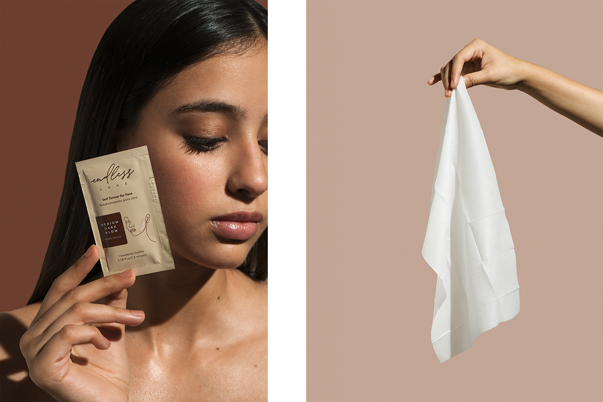
The brand identity’s graphics are formed by different illustrations emphasizing faces, body parts and the act of applying these products. We looked to keep these simple and slightly abstract, with only enough detail to distinguish what you are looking at. The linework in these illustrations is similar to that of the wordmark, making the brand system more consistent.


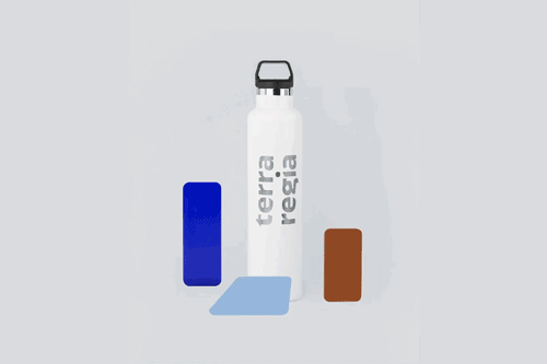
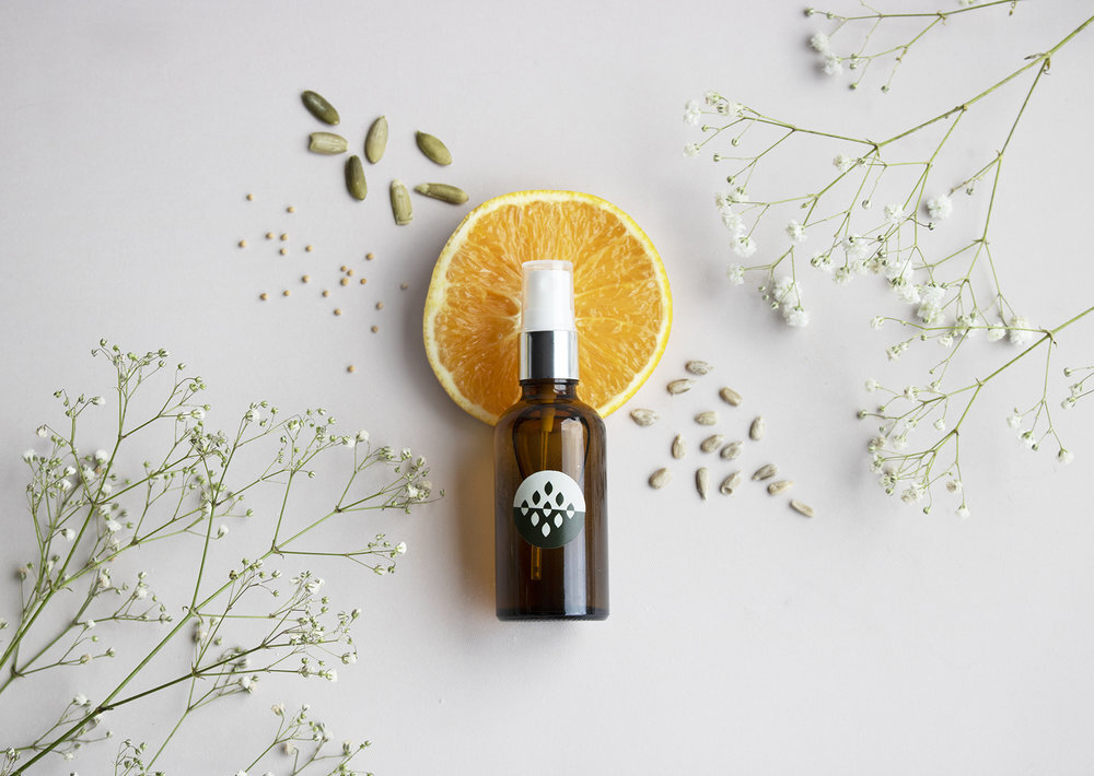
PACKAGING
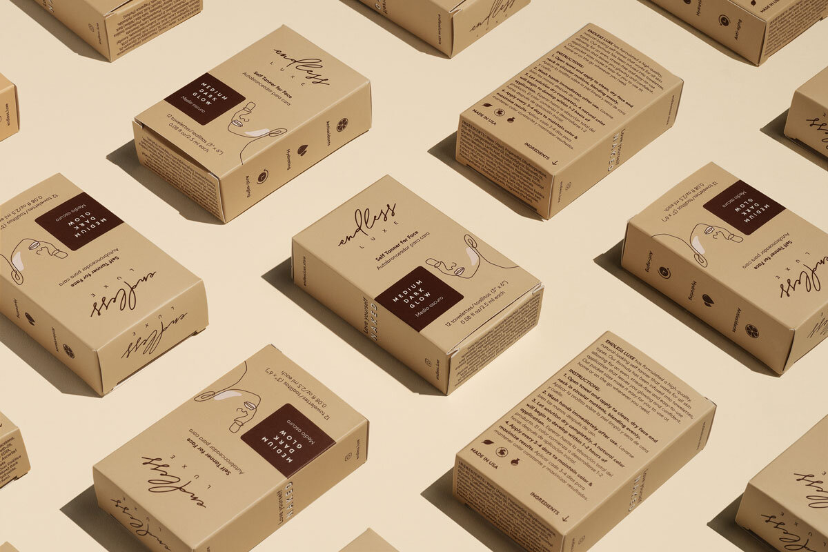
An important part of this project is the packaging design, which involved keeping the brand identity consistent on pouches and boxes for these products to be delivered in. The challenge here was to fit a lot of information on these small packages, but we achieved this by dividing the information hierarchically. On the front we showed a clear illustration of the product’s use: face or body, as well as the important descriptions. On the side we showed the different icons that explain the product’s benefits. And on the back we fit all of the technical information, such as ingredients and directions.


WHAT WE DID:
— Branding Identity Design
— Packaging Design
Design: Caracter
Design Direction: Adriana Longoria
Design Support: Regina Kaún & María Paula Valdés
Photography: Michelle Montoya / Pistachelle
Where to purchase Endless Luxe products:
www.endlessluxe.com
VIEW MORE PROJECTS: